
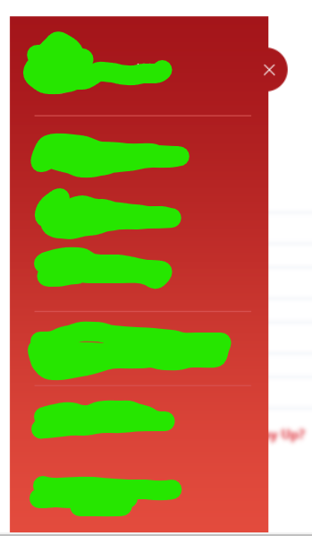
Issue
I am trying to achieve the follow Drawer display on my Flutter app. I have a problem to paint the X close icon, which is outside of the drawer. Is there are easy way to draw that X that is out of drawer layout? Please note that drawer content itself can have many rows (scrollable.)
So far i come to following solution:
import 'package:flutter/material.dart';

class tempDrawer extends StatelessWidget {
  @override
  Widget build(BuildContext context) {

    return
      Container(
          width: 250,

          child:Drawer(child:
          SafeArea(child:Container(
            //width: 300,
              decoration: BoxDecoration(
                  gradient: LinearGradient(
                    begin: Alignment.topCenter,
                    end: FractionalOffset.bottomCenter,
                    colors: [Color(0xffa4151a), Color(0xffe34b3d)],
                    stops: [0, 1],
                  )),
              child: ListView(
                padding: EdgeInsets.zero,
                children: <Widget>[
                  Row(mainAxisAlignment: MainAxisAlignment.spaceBetween,
                      children: [
                        Container(width:70,child:ClipOval(child: Image(
                          image: AssetImage("images/face.png"),
                          fit: BoxFit.cover,
                          height: 70,
                          width: 70,
                        ))),
                        Container(width: 16,),
                        Container(width: 129,child:Text("Alex assdsddff",overflow: TextOverflow.clip, style: TextStyle(color: Colors.white),)),
                        ClipOval(
                            child:Container(
                                decoration: BoxDecoration(color: Color(0xffa4151a)),
                                width: 50,
                                child:
                                Container(child: Icon(Icons.close,size: 40,color: Colors.white,)))),
                      ]),
                  Divider(color: Colors.white,indent: 20,endIndent: 20,),
                  Row(
                    children: <Widget>[
                      Icon(Icons.home_outlined,color: Colors.white,),
                      Padding(
                        padding: EdgeInsets.only(left: 8.0),
                        child: Text("HOME", style: TextStyle(color: Colors.white),),
                      )
                    ],
                  ),

                ],
              )),
          )
          ));
  }
}
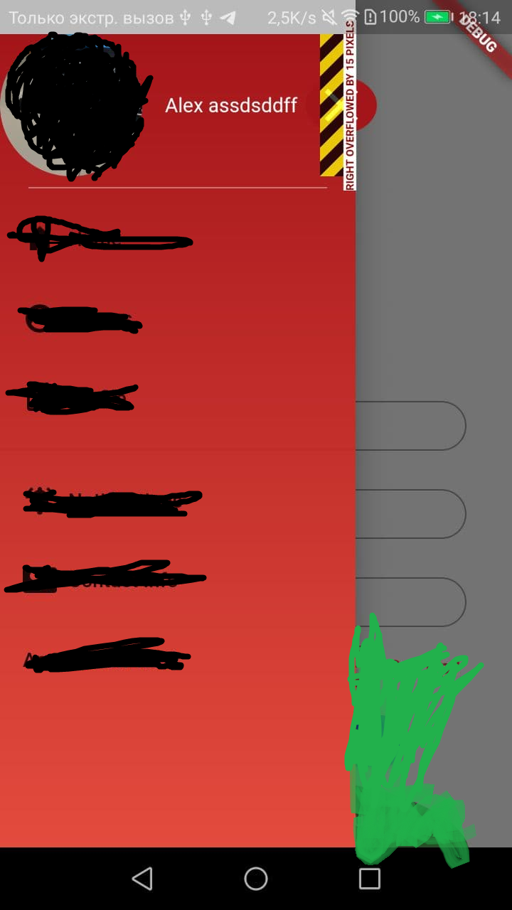
Which give me result that i need, but i have an "overflow" message at a place where my icon is located. Is there any more correct way to place the close icon or at least somehow get rid of overflow message per specific widget?
Solution
You use Stack to divide Drawer in two part and get the UI. An easier way will be using transform.
Remove ClipOval widget and use shape: BoxShape.circle on Container.
class tempDrawer extends StatelessWidget {
  final drawerWidth = 250.0;
  final double iconButtonSize = 50;
  @override
  Widget build(BuildContext context) {
    return SizedBox(
      width: drawerWidth + iconButtonSize * .5, // we want half outside
      child: Theme(
        // make transparent drawer
        data: Theme.of(context).copyWith(
          canvasColor: Colors.white.withOpacity(0),
        ),
        child: Drawer(
          child: Stack(
            children: [
              Container(
                  width: drawerWidth,
                  decoration: const BoxDecoration(
                    gradient: LinearGradient(
                      begin: Alignment.topCenter,
                      end: FractionalOffset.bottomCenter,
                      colors: [Color(0xffa4151a), Color(0xffe34b3d)],
                      stops: [0, 1],
                    ),
                  ),
                  child: ListView(
                    padding: EdgeInsets.zero,
                    children: <Widget>[
                      Row(
                          mainAxisAlignment: MainAxisAlignment.spaceBetween,
                          children: [
                            Container(
                              width: 70,
                              color: Colors.green,
                              // child: ClipOval(
                              // child: Image(
                              //   image: AssetImage("images/face.png"),
                              //   fit: BoxFit.cover,
                              //   height: 70,
                              //   width: 70,
                              //   //   ),
                              // ),
                            ),
                            const SizedBox(
                              width: 16,
                            ),
                            SizedBox(
                              // remove  img+space width
                              width: drawerWidth - 70 - 16,
                              child: const Text(
                                "Alex assdsddff",
                                overflow: TextOverflow.clip,
                                style: TextStyle(color: Colors.white),
                              ),
                            ),
                          ]),
                      Divider(
                        color: Colors.white,
                        indent: 20,
                        endIndent: 20,
                      ),
                      Row(
                        children: <Widget>[
                          Icon(
                            Icons.home_outlined,
                            color: Colors.white,
                          ),
                          Padding(
                            padding: EdgeInsets.only(left: 8.0),
                            child: Text(
                              "HOME",
                              style: TextStyle(color: Colors.white),
                            ),
                          )
                        ],
                      ),
                    ],
                  )),
              Positioned(
                top: 20,
                right: 0,
                child: Container(
                  alignment: Alignment.center,
                  decoration: const BoxDecoration(
                    color: Colors.pink,
                    shape: BoxShape.circle,
                  ),
                  width: iconButtonSize,
                  height: iconButtonSize,
                  child: GestureDetector(
                    onTap: () {
                      print("close");
                    },
                    child: const Icon(
                      Icons.close,
                      size: 40,
                    ),
                  ),
                ),
              ),
            ],
          ),
        ),
      ),
    );
  }
}
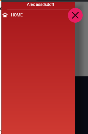
You can use Drawer:elevation to handle shade.
Answered By - Yeasin Sheikh


0 comments:
Post a Comment
Note: Only a member of this blog may post a comment.